Welcome to the first Slasher Manager devlog. This is where I'll share what I'm working on, what shipped, what's broken, and where the design is going.
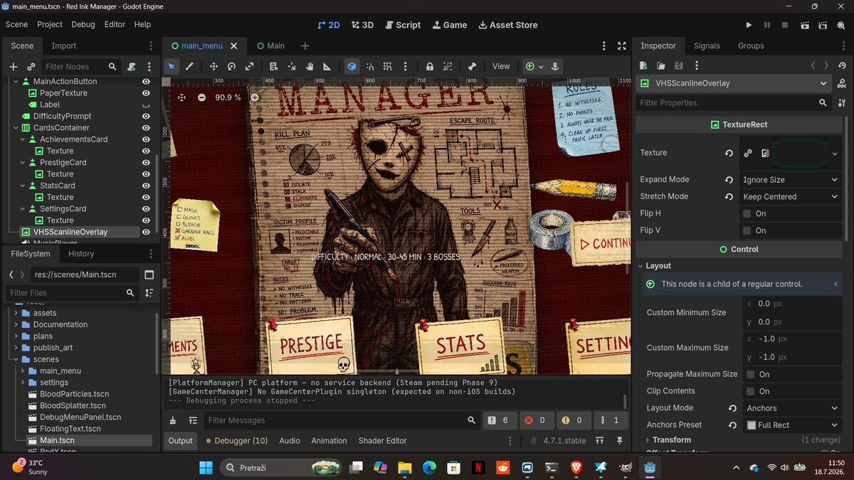
This week, the main menu got a complete visual overhaul. The new look blends two visual languages that drove the original mockup: a VHS horror cover and a hand-drawn ink-and-paper notebook. The result is a single 16:9 screen that feels like an old VHS tape case torn open over a detective's notebook.
WHAT YOU'RE LOOKING AT
- The masked figure in the center is the slasher — a Myers-style silhouette drawn in marker and ballpoint, with blood splatter added in a separate pass for the visceral hit.
- The four index cards along the bottom (Achievements, Prestige, Stats, Settings) are physically scattered and rotated, like polaroids pinned to a corkboard.
- The red MANAGER lettering at the top is screen-printed in distressed caps — it's the title card of the VHS case.
- The right side carries the playable tape: Rules, a Continue button, and a slice of yellow duck tape that hints at the in-game upgrade shop.
- A subtle VHS scanline overlay runs across the whole composition for an analog look.
Under the hood: every card, the masking tape, the background figure are Godot Control nodes — no runtime layout overrides. The VHS effect is a single shader applied to a TextureRect overlay. The whole thing is scene-first.
WHAT'S NEXT
The responsive in-game layout — topbar with resources, two-page notebook spread for hunt area and shop — is the second priority. The Steam page goes live as soon as the build is closer to ready.
Follow along here and on itch.io for updates. If you have feedback on the menu direction, I'd love to hear it.